Self-Supervised Learning: Part 1 Image网

Whenever I start a new computer vision competition on Kaggle, I instinctively dust off my trusty set of ImageNet weights, load them up into a ResNet XResNet, begin training and watch as my GPU spins up and the room begins to warm. The nice thing about this approach is that my room doesn’t get as warm as it used to when I initialized my networks with random weights. All this is to say: Pretraining a neural network on ImagetNet lets us train on a downstream task faster and to a higher accuracy.

However, sometimes I dig into the rules of a competition and see things like:

You may not use data other than the Competition Data to develop and test your models and Submissions.

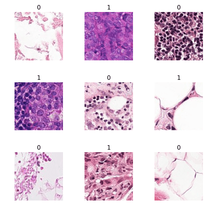
Even worse, sometimes my ImageNet weights just aren’t, like, helping very much. This is especially noticeable in the medical domain when the images we’re looking at are quite a bit different than the natural images found in ImageNet. If we put on our “ML Researcher” hats for a second, we would probably say this is because images from the natural world and images from an MRI “come from different distributions”:

Jeremy Howard from fast.ai covers this in more detail in a recent post on self-supervised learning. He says:

However, as this paper notes, the amount of improvement from an ImageNet pretrained model when applied to medical imaging is not that great. We would like something which works better but doesn’t will need a huge amount of data. The secret is “self-supervised learning”.

You should definitely read it, but a quick summary might sound something like:

Self-supervised learning is when we train a network on pretext task and then train that same network on a downstream task that is important to us. In some sense, pretraining on ImageNet is a pretext task and the Kaggle competition we’re working on is the downstream task. The catch here is that we’d like to design a pretext task that doesn’t require sitting down to hand label 14 million images.

The Holy Grail of self-supervised learning would be to find a set of techniques that improve downstream performance as much as pretraining on ImagetNet does. Such techniques would likely lead to broad improvements in model performance in domains like medical imaging where we don’t have millions of labeled examples.


Imagenette, ImageWoof, and Image网 Datasets

So if these techniques could have such a huge impact, why does it feel like relatively few people are actively researching them? Well, for starters most recent studies benchmark their performance against ImageNet. Training 90 epochs of ImageNet on my personal machine would take approximately 14 days! Running an ablation study of self-supervised techniques on ImageNet would take years and be considered by most to be an act of deep self-hatred.

Lucky for us, Jeremy has curated a few subsets of the full ImageNet dataset that are much easier to work with and early indications suggest that their results often generalize to the full ImageNet (when trained for at least 80 epochs). Imagenette is a subset of ImageNet that contains just ten of its most easily classified classes. ImageWoof is a subset of ImageNet that contains just ten of its most difficult-to-classify classes. As the name suggests, all the images contain different breeds of dogs.

Image网 (or ImageWang) is a little different. It’s a brand new blend of both Imagenette and ImageWoof that contains:

  • A /train folder with 20 classes
  • A /val folder with 10 classes (all of which are contained in /train)
  • An /unsup folder with 7,750 unlabeled images

The reason Image网 is important is because it’s the first dataset designed to benchmark self-supervised learning techniques that is actually usable for independent researchers. Instead of taking 14 days to train 90 epochs, we’re looking at about 30 minutes.

For our first Imageexperiment, let’s just try to establish that self-supervised learning works at all. We’ll choose a pretext task, train a network on it and then compare its performance on a downstream task. In later posts we’ll build off of this foundation, trying to figure out what techniques work and what don’t.


Pretext Task: Inpainting on Image

Full Notebook: Available on GitHub

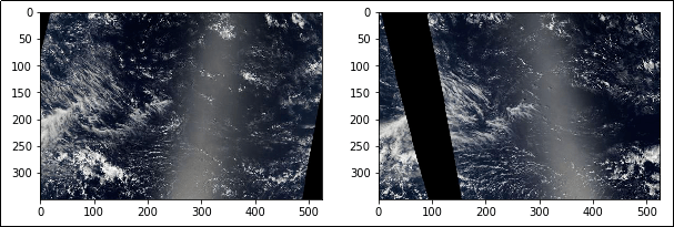
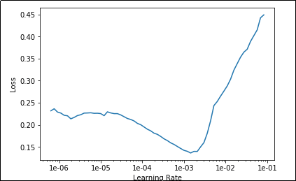
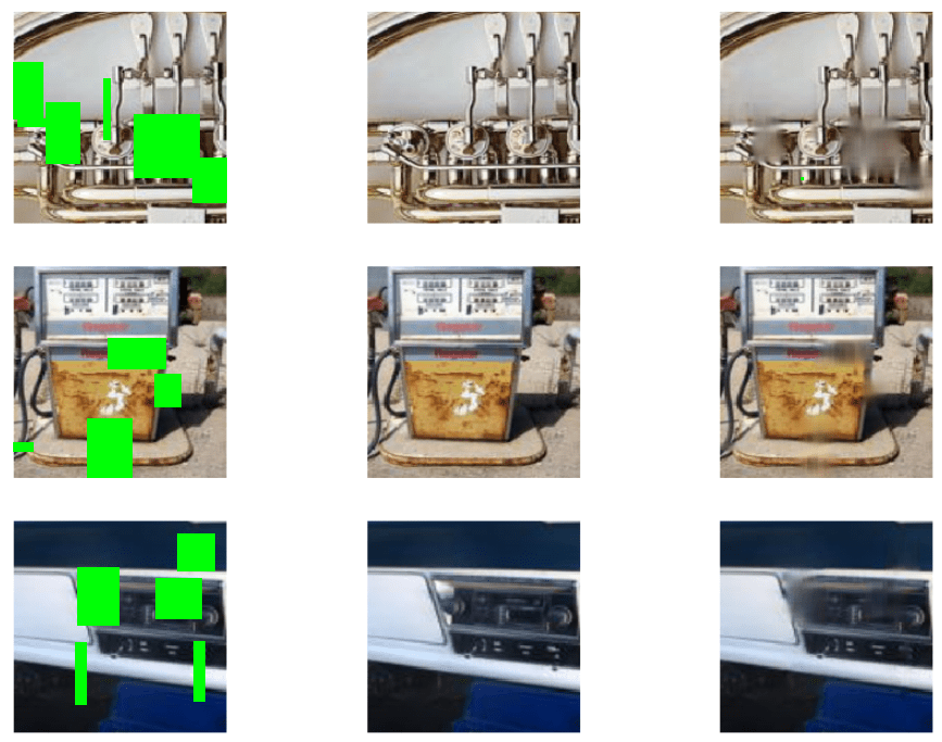
Over the years people have proposed dozens of pretext tasks, and the one we’re going to look today at is called Inpainting. The basic idea is to take an image, remove patches of it and tell our model to fill in the missing pieces. Below, the removed patches have been highlighted in green:

Inpainting
Sample values from our inpainting model. Note the incorrect prediction of desk shape in the model’s output.

This approach is described in Context Encoders: Feature Learning by Inpainting. Their claim is that by training on this pretext task, we can improve performance on downstream tasks:

We quantitatively demonstrate the effectiveness of our learned features for CNN pre-training on classification, detection, and segmentation tasks.

The hope here is that by filling in images repeatedly, our network will learn weights that start to capture interesting information about the natural world (or at least about the world according to Image网). Perhaps it will learn that desks usually have four legs and dogs usually have two eyes. I want to emphasize that this is a hope, and I haven’t yet seen strong evidence of this actually happening. Indeed, in the model output above, notice how the model mistakenly believes the edge of the desk slopes downwards and connects to the the chair. Clearly this model hasn’t learned everything there is to know about how desks and chairs interact.

The complete code for this pretext task is available as a Jupyter Notebook. We create a U-Net with an xresnet34 backbone (though vanilla ResNets worked as well). Next, we create a RandomCutout augmentation that acts only on input images to our network. This augmentation cuts out random patches of input images and was provided by Alaa A. Latif. (He’s currently working with WAMRI on applying these techniques to medical images and has seen some promising results!)

Finally we pass the cutout images through our U-Net which generates an output image of the same size. We simply calculate the loss between the model’s output and the correct un-altered image using PyTorch’s MSELoss.

After training we can take a look at the output and see what our model is generating (cutout regions highlighted in green):

model_output
Left: Cutout Images. Center: Original Images. Right: Model output

So our model is at least getting the general colors correct, which might not seem like much but is definitely a step in the right direction. There are steps we could take to generate more realistic image outputs, but we only want to go down that path if we think it will improve downstream performance.

The last thing we’re going to do here is save the weights for our xrenset34 backbone. This is the portion of the network that we will take and apply to our downstream task.

Downstream Task: Image

Full Notebook: Available on GitHub

At the heart of this experiment we are trying to answer the question:

What is better: the best trained network starting with random weights, or the best trained network starting with weights generated from a pretext task?

This may seem obvious but it’s important to keep in mind when designing our experiments. In order to train a network with random weights in the best way possible, we will use the approach that gives the highest accuracy when training from scratch on Imagenette. It comes from best performing algorithms on the ImageNette leaderboard.

To be honest, I’m not sure what the best approach is when it comes to training a network with pretext task weights. Therefore we will try two common approaches: training only head of the network and training the entire network with discriminitive fine-tuning.

This gives us three scenarios we’d like to compare:

  1. Training an entire model that is initialized with random weights.
  2. Training the head of a model that is initialized with weights generated on a pretext task.
  3. Training an entire model that is initialized with weights generated on a pretext task.

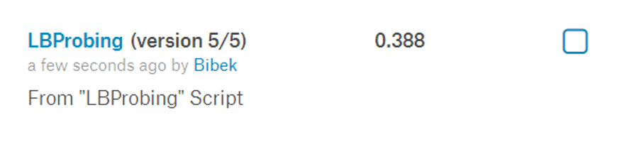
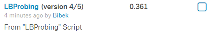
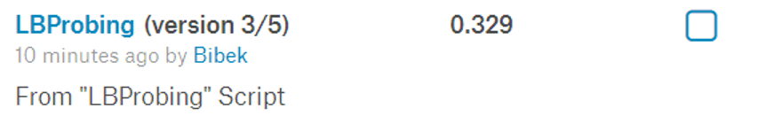
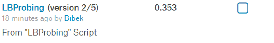
The full training code is available as a Jupyter notebook. Each approach was trained for a total of 100 epochs and the results averaged over the course of 3 runs.

The results:

  • Random Weights Baseline: 58.2%
  • Pretext Weights + Fine-tuning head only: 62.1%
  • Pretext Weights + Fine-tuning head + Discriminitive Learning Rate: 62.1%

Basically, we’ve demonstrated that we can get a reliable improvement in downstream accuracy by pre-training a network on a self-supervised pretext task. This is not super exciting in and of itself, but it gives us a good starting point from which to move towards more interesting questions.

My overall goal with this series is to investigate the question: “Can we design pretext tasks that beat ImageNet pretraining when applied to medical images”?

To move toward this goal, we’re going to have to answer smaller, more focused questions. Questions like:

  • Does training for longer on our pretext task lead to larger improvements in downstream task performance?
  • What pretext task is the best pretext task? (Bonus: Why?)
  • Can we train on multiple pretext tasks and see greater improvements?


Special thanks to Jeremy Howard for helping review this post and to Alaa A. Latif for his RandomCutout augmentation.

2019: A retrospective

Last year I set three goals for myself to work on over the course of 2019:

  1. Stream on Twitch during the week
  2. Write one blog post a week
  3. Finish reading Deep Learning by Ian Goodfellow


Goal 1: Stream on Twitch on weekdays

Result:

I can’t figure out how to get a “days streamed” metric out of Twitch, but the above suggests I did alright. There were a few periods in June and August where I took breaks from streaming but I’m pretty happy with my overall consistency.

I made a grand total of $37.82 over the year which works out to about 12 cents an hour!

In 2020 I’d like to continue streaming and will stick to the same schedule.

Goal 2: Write one blog post a week

Result: 12 posts / 52 weeks

So this is the second year I’ve hit about one blog post a month and been completely unable to maintain a pace of one post per week. There’s probably a few reasons for this but in general I haven’t come up with a good “series” of blog posts that I can consistently churn out.

For this reason I’m not going to renew this as a goal for 2020.

Goal 3: Read Deep Learning by Ian Goodfellow

Result: 700 pages / 700 pages

So this was pretty much a complete success. As I mentioned in last year’s retrospective the initial two chapters were intimidating but the rest of the book was not nearly as hard to get through. I wrapped this one up fairly early in the year and while I didn’t read any other books, I’ve started to become confident at reading papers themselves.

Overall I’m not sure if I’d recommend this book to a new learner in 2020. Lots has changed in the years since it was written and some of the off-hand recommendations in makes actually turned out to be incorrect. That said, if an updated version is ever released, I will definitely read it.


Other stuff I did in 2019

There were a lot of non-goal tasks that I worked on throughout the year:

fastai – I worked through the first course during January and was invited to participate in the second course in April. I wish I’d found this course earlier since it really got me started on tackling both deep learning papers and real world projects.

Kaggle Competitions – After completing fastai’s courses, I worked on my first four Kaggle competitions and got progressively better placements on each. In total I received two bronze medals which moved me up to the rank of Kaggle Competition Expert.

Paper Reading – In general I became much more comfortable reading papers. My favorites were  Mixup: Beyond Empirical Risk Minimization and Bag of Tricks for Image Classification and Convolutional Neural Networks.

Visualizing RNNs – I worked on a cool little tutorial that visualizes each step of an RNN.  The post is available here.


Goals for 2020

Overall I’m very happy with how 2019 went. While there was room for improvement it felt like things having been moving in the right direction. With that in mind I’d like to set a few goals to keep me moving in that direction:

  • Stream on Twitch every weekday
  • Get one gold medal on Kaggle
  • Create one deep learning video each month
  • Either get a job in deep learning or start a company around it


Kaggle Clouds: Competition Retrospective

In the Understanding Clouds from Satellite Images Kaggle contest, competitors were challenged to identify and segment different cloud formations in a series of satellite photos. There were four different kinds of cloud formations we were tasked with identifying. The lines between them can be fuzzy at times, but they’re described as follows:

clouds.png

Given a satellite photo, we’re challenged to identify these formations and produce an output similar to:

clouds2


Ultimately my solution received a score of  0.65571which put me at 137/1538 and earned me my second bronze medal on Kaggle (and makes me a “Kaggle Competitions Expert”).

kaggle_placement


What worked for me

My solution used a Feature Pyramid Network (FPN) with an efficientnet-b2 encoder. For data augmentation I used horizontal and vertical flipping as well as rotations and a small amount of zoom. I trained 10 folds and used vertical flipping and horizontal flipping for test-time augmentation. The image input size to my network was 448x672.

Feature Pyramid Networks

For much of this competition I tried various approaches with U-Nets, a common approach used to segment medical images. Only in the last month did I start to experiment with other approaches. I quickly found that FPNs lead to better segmentation performance on this problem.

Removed C2 and P2 Layers

The labels for this competition were created via crowdsourcing. Users were presented with a satellite image and asked to drag boxes around clouds that they believed fell into one of the four classes. As such the labels for this competition were generally large and rectangular:

sample_labels

This observation lead me to believe that we would be better off making “large and rectangular” predictions. One way to encourage this would be to make predictions using more coarse layers of the FPN. This meant removing the C2 and P2 layers of the FPN. This simple change lead to an improvement of  0.005 CV and LB score.

EfficientNet

For most of this competition I experimented with ResNets. Toward the end of the competition I decided to give EfficientNet a shot and found that it drastically improved my score.


What did not work (for me)

Image Pairs

One insight I made early in this competition was that the test and train set had very similar images within them. For example here are two images taken only a few hours apart:

similar_images

I figured that since we knew the labels for one of the images, we could use this information to help us label the other. Unfortunately I was not able to successfully use this information. It’s possible that the label noise (different people see different clouds in each photo) makes it too difficult for us to make use of these pairs. It’s equally possible that I made a mistake and should have spent more time investigating these pairs!

Pretraining

While training a model to find similar images, I downloaded over 12,000 additional images from NASA’s Earthdata repository. I figured that training a ResNet-50 to find similar images might help it learn to find useful features in satellite images that we could then use in our primary task. I tried to use these weights in my segmentation model but they did not noticeably improve my results. Once again I am not sure if I gave this idea enough attention, as it really seems like it should have worked.


What others did that worked

Classification head

Many of the most successful solutions used both a segmentation model and a classification model. The goal of the classification model was simply to remove entries from segmentation entirely. This ends up helping considerably because predicting any pixels for an empty label will instantly get you a dice score of zero on that example.

Max Pixel Value

Another clever approach was to ensure that your model always made at least one prediction for a given image. Every image has at least one class present, so it’s important not to submit any empty masks. Some users took the maximum pixel value from all classes on a given image and marked that class as present.

Comparing Output Distributions

Early on in this competition I learned how to calculate the expected output distributions for each class. (I even wrote a blog post about it!) Unfortunately I was either too lazy or too inexperienced to effectively make use of this knowledge. I should have been comparing my predicted output distribution with this expected test set distributions. This may have helped guide the creation of an effective classifier.


Overall this competition went well. I didn’t overfit the leaderboard and ended up moving up 48 positions and qualified for a bronze medal. That said I can’t help but feel a little bummed out that I wasn’t able to take advantage of the image pairs I identified early on. Hopefully I’ll be able to earn a silver or even gold medal in future competitions.


Probing Kaggle Leaderboards with Dice Score

This post was based on the discussion posted by Bibek here and the related discussion posted by Heng CherKeng here.

In the Understanding Clouds from Satellite Images Kaggle contest, competitors are challenged to identify and segment different cloud formations in a series of satellite photos. There are four different kinds of cloud formations we are tasked with identifying. The lines between them can be fuzzy at times, but they’re described as follows:

clouds.png

Given a satellite photo, we’re challenged to identify these formations and produce an output similar to:

clouds2

In order to compare submissions against one another, the competition organizers decided to use the metric Dice Score. It’s formula is given as:

D

Where:

  • X is the set of our predictions
  • Y is the set of ground truth labels (1 for True, 0 for False)

One important note is that Dice Score is defined as 1 whenever X and Y are empty. This leads to an interesting property that will allow us to probe the leaderboard for useful information.

Before we do that, let’s look at a few examples on super small 4x4 images:

Predictions (X)

preds1

Labels (Y)

labels1

Dice Score = \frac{2*{(0.50 * 1.00 +0.75*1.00+0.01*0.00+0.01*0.00)}}{(0.50 + 0.75+0.01+0.01) + (1.00+1.00+0.00+0.00)} = 0.76


For an image with no labels where we predict very small probabilities:

Predictions (X)

preds2

Labels (Y)

labels2

Dice Score = \frac{2*{(0.01 * 0.00 +0.00*0.00+0.00*0.00+0.00*0.00)}}{(0.01+0.00+0.00+0.00) + (0.00+0.00+0.00+0.00)} = 0.00

That weird… Even though we’re very, very close to the right answer we get the worst possible Dice Score. If we had left that first position empty, we would have had a perfect Dice Score (since Dice Score is defined as 1 whenever both sets are empty).

This property allows us to probe the Kaggle leaderboard for some interesting information.

In our contest there are 3,698 test images. Since there are four possible classes (Sugar, Flower, Gravel and Fish) we need to make four sets of predictions (or masks) for each image. This means we’ll be making 14,792 sets of predictions in total.

If we submit a set of empty predictions, we can use our score to calculate how many empty masks are present in the total set*.

So an empty submission gets us a score of 0.477. We know that each time we made a correct empty prediction we got a perfect Dice Score of 1.0, and we know that each time we made an incorrect empty prediction we got the worst Dice Score of 0.0. This means we can calculate the total number of empty masks.

0.477 * 14,792 = ~7,055 empty masks.

We can go further and calculate the exact number of empty masks for each class.

Let’s take take our empty predictions for a single class and replace them with a bad prediction (eg. a single pixel in the top-left corner). On every single empty mask for this class, our score will drop from 1.0 to 0.0.** We can use this drop to calculate how many empty masks must have been present.

When we alter our predictions for Sugar our score drops to:

SugarNotEmpty

When we alter our predictions for Gravel our score drops to:

GravelNotEmpty

When we alter our predictions for Flower our score drops to:

FlowerNotEmpty

When we alter our predictions for Fish our score drops to:

FishNotEmpty

Given the change in score, we can calculate the empty labels for each class as follows:

Sugar

(0.477 – 0.388) * 14,792 = ~1316 empty masks for Sugar

Gravel

(0.477 – 0.361) * 14,792 = ~1716 empty masks for Gravel

Flower

(0.477 – 0.329) * 14,792 = ~2190 empty masks for Flower

Fish

(0.477 – 0.353) * 14,792 = ~1834 empty Masks for Fish


So what can we do with this information? The most obvious strategy would be to use this information when creating a validation set. Normally this would help us achieve a more accurate validation set (Why Validation Sets Matter) but there’s something strange going on with this particular competition that suggests a stronger validation set might not actually help.

An alternate use for this technique would be to help in verifying a data leak. I suspect that such a leak exists and that one can get a perfect score on a portion of the images in the test set. We could use this technique to verify the leak by modifying an empty submission with a handful of “perfect” submissions and observing if our score increases by the predicted amount.


* In reality, the resulting score we’re looking at is calculated on only 25% of the data. After the contest concludes, the organizers will re-run our submissions on the full dataset. It’s worth being aware of the possibility that the 25% of the data we’re being graded on may have been specifically chosen to be misleading, but for the remainder of this post we’ll assume it’s representative of the entire test set.

** Technically we might accidentally hit a correct label in some of the non-empty masks, but the change to our Dice Score will be so small that we can ignore this case.

Freesound Audio Tagging 2019

Shoutout to my Kaggle partner on this competition: Nathan Hubens

In the Freesound Audio Tagging 2019 competition participants were given audio clips and challenged to write a program that could identify the sounds in each clip. Clips could contain multiple sounds from up to 80 categories.

Here’s a clip that contains both the label Church_bell and Traffic_noise_and_roadway_noise:

The audio clips come from two sources:

  1. A carefully human-curated dataset
  2. A noisy dataset with many mislabeled examples

The organizers of this contest wanted to see whether or not participants could find a clever way of using the noisy dataset to improve overall model performance. Labels in both datasets were roughly balanced.

Validation Set

Participants’ programs were tested against a separate, withheld curated test set. This was important to keep in mind when generating a validation set. In order to match our validation set as closely to the test set as possible we wanted to make sure it only contained curated samples as well.

It was also important to ensure that our validation set was label balanced. To achieve this we used an approach called MultiLabelStratifiedKFolds which allows us to generate label-balanced validation sets. Credit to trent-b’s iterative-stratification package for this.

Stuff We Tried That Worked

LogMel Spectrograms – One of the most common approaches in this competition was to take the raw audio input and transform it into a visual spectrogram. After this we could use traditional image recognition techniques (Convolutional Neural Networks) to distinguish between the spectrogram of different sounds. LogMel Spectrograms are widely reported to be the most effective waveform for a deep learning system so that’s what we went with.

spectrogram
An audio clip converted into a log-mel spectrogram

Repeating Short Sounds – The audio sounds varied from less than 1 second to over 50 seconds. Some participants suggested simply padded the short sounds with blank space to make all sounds a minimum of 3 seconds long. However, this meant that large portions of the image contain only silence. Instead, we repeated short sounds multiple times to make them a minimum of 3 seconds long.

spectrum
Sample audio clip repeated twice

XResNet – XResNet is a modification of the traditional ResNet architecture with a few changes suggested by the paper Bag of Tricks for Image Classification with Convolutional Neural Networks.

Test Time Augmentation – The inputs to our neural network are of fixed size (128x128) but the audio clips are of variable length. This can cause problems when the sound we’re trying to identify wasn’t located within the crop we’ve taken. To help compensate for this we make sure to take every sequential crop of an image at test time and average the results. This should help guarantee that a given sound is covered by a crop at some point.

Mixup – A data augmentation technique covered in mixup: Beyond Empirical Risk Minimization. We combine two crops from different images into a single image while also combining their labels. This seemed to help prevent our network from being able to overfit the data as we could create a huge number of combinations of images using different images.

Stuff We Tried That Didn’t Work

Noisy Dataset – We spent a substantial period of time unsuccessfully trying to incorporate the noisy dataset into our system. We tried using label smoothing to reduce the noise introduced by the dataset but still got lower results. We tried finding individual label categories for which the noisy dataset outperformed the clean dataset, but found none.

Using F-Score as a Proxy for Lwlrap –  The biggest mistake we made in this contest was trying to use F-score as a proxy metric for lwlrap instead of just using lwlrap metric directly. We figured that as F-score went up so would lwlrap but that was not always the case. Unfortunately we wasted weeks trying to compare approaches and techniques based on F-score. For me this really drilled home the message: “ALWAYS use the competition metric” when designing machine learning systems.

It seems some things just have to be learned the hard way.

Stuff Others Tried That Worked

Noisy Dataset – Other competitors found a lot of success in training the network on the noisy dataset for a number of epochs before switching over and using the curated dataset for the rest of training. This strategy was used by almost every high scoring team.

Data Augmentation –  Many competitors used interesting data augmentation techniques such as SpecAugment which masked out entire frequencies or timesteps from audio clips.

Intelligent Ensembling – Some approaches trained multiple models and then ensembled the results of these models. Some combined the results of these models using approaches such as geometric mean blending or an additional MLP.

Results

On the whole the competition went very well. Our team got 95th place out of 880 teams which awarded us both our first Kaggle Bronze Medal!

score

Our team received an lwlrap score of 0.6943 while the top scoring entry posted a score of 0.7598.


Getting Inside a Neural Network

Full Notebook on GitHub.

Usually when we work with a neural network we treat it as a black box. We can pull a few knobs and levers (learning rate, weight decay, etc.) but for the most part we’re stuck looking at the inputs and outputs to the network. For most of us this means we simply plot loss and maybe a target metric like accuracy as training progresses.

9IiAKow
Plotting loss to monitor network performance

This state of affairs will leave almost anyone from a software background feeling a little empty. After all, we’re used to writing code in which we try to understand every bit of internal state. And if something goes wrong, we can always use a debugger to step inside and see exactly what’s going on. While we’re never going to get to that point with neural networks, it feels like we should at least be able to take a step in that direction.

To that end, let’s try taking a look at the internal activations of our neural network. Recall that a neural network is divided up into many layers, each with intermediate output activations. Our goal will be to simply visualize those activations as training progresses. For this we’ll use fastai’s HookCallback, but since fastai abstracts over PyTorch, the same general approach would work for PyTorch as well.

First we’ll start by defining a StoreHook class that initializes itself at the beginning of training and keeps track of output activations after each batch. However, instead of saving each output activation (there can be tens of thousands) let’s use .histc() to count the number of activations across 40 different ranges (or buckets). This allows us to determine whether most activations are high or low without having to keep them all around.


# Modified from: https://forums.fast.ai/t/confused-by-output-of-hook-output/29514/4
class StoreHook(HookCallback):
def on_train_begin(self, **kwargs):
super().on_train_begin(**kwargs)
self.hists = []
def hook(self, m, i, o):
return o
def on_batch_end(self, train, **kwargs):
if (train):
self.hists.append(self.hooks.stored[0].cpu().histc(40,0,10))

view raw

StoreHook.py

hosted with ❤ by GitHub

Next we’ll define a method that simply creates a StoreHook for a given module in our neural network. We attach our StoreHook​ as a callback for our fastai cnn_learner.


# Simply pass in a learner and the module you would like to instrument
def probeModule(learn, module):
hook = StoreHook(learn, modules=flatten_model(module))
learn.callbacks += [ hook ]
return hook

view raw

probeModule.py

hosted with ❤ by GitHub

And that’s pretty much it. Despite not being much code, we’ve got everything we need to monitor the activations of any module on any learner.

Let’s see those activations!

To keep things simple we’ll use ResNet-18, a relatively small version of the network. It looks something like:

lQf0Q9J

We’ll instrument conv1, conv2_x, conv3_x, conv4_x, and conv5_x.

When we run ResNet-18 against MNIST for three epochs, we get an error rate of approximately 3.4% (ie. 96.6% accuracy) and we can plot our activations:

activations

In the above:

  • The x-axis represents time (or batch number)
  • The y-axis represents the magnitude of activations.
    • More yellow indicates more activations at that magnitude
    • More blue indicates fewer activations at that magnitude.

If you look very closely at the beginning, most activations start out near zero and as training progresses they quickly become more evenly distributed. This is probably a good thing and our low error rate confirms this.

So if this is what “good” learning looks like, what does “bad” learning look like?

Let’s crank up our learning rate to from 1e-2 to 1 and re-run. This time we get an error rate of 89.9% (ie. accuracy of 10.1%) and activations that look like:activations2.png

This time as we move through time we see that our activations trend downward toward zero. This is probably bad. If most of our activations are zero then the gradients for these units will also be zero and the network will never be able to update these bad units.

Show me something useful

The above example was a little contrived. Will plotting these activations ever actually be useful?

Recently I’ve been working on Kaggle’s Freesound Audio Tagging challenge in which contestants try to determine what sounds are present in a given audio clip. By converting all the sounds into spectrograms we can rephrase this problem as an image recognition problem and use ResNet-18 against it.

I ran my first network against the data with:


learn = cnn_learner(data, models.resnet18, pretrained=False, metrics=[f_score])
learn.unfreeze()
learn.fit_one_cycle(10, max_lr=slice(1e-6,1e-2))

And visualized the activations with:

activations3

This seems even weirder than before. None of our layers have evenly distributed distributions of activations and the first layer looks completely broken. Almost all of the first layer’s activations are near zero!

After reflecting on this problem I realized that the problem was I was using discriminitive learning rates. That is, I train the early layers with a very small learning rate of 1e-6 and the latter layers with a larger rate of 1e-2. This approach is very useful when training a network that had been pretrained on another dataset such as ImagetNet. However in this particular competition we weren’t allowed to use a pretrained model! In essence this meant that after randomly initializing the first few layers, they weren’t able to learn anything because the learning rate was so small.

The fix was to use a single learning rate for all layers:


learn.fit_one_cycle(10, max_lr=(1e-2))

After this change the activations looked like:

activations4

Much better! Our activations started off near zero but we can clearly see that they change as learning progresses. Even our latter layers seem to distribute their activations in a much more balanced way.

Not only do our activations look better, but our network’s score improved as well. This single change improved the f_score of my model from 0.238104 to 0.468753 with a corresponding improvement in loss.

After making this single change:

Validation Sets Matter

When you set out to learn about machine learning you’re usually told about the importance of creating a good training, validation and test set. The training set will seem important (we need a good set of data to train on) the test set will seem important (we need a good, fair way to compare our model to other models) but the validation set… well… it doesn’t seem that important. Students are usually so overwhelmed with other aspects of data science that they simply create their validation set by randomly sampling from the original training set.

Indeed on many of the standard benchmark datasets (CIFAR 10, ImageNet, MNIST etc.) random sampling is a perfectly fine way to create a validation set. The training set and test set come from roughly the same distribution so your randomly sampled validation set is a good proxy for the test set. Typically when your model improves on your validation set, you’ll also see improvements on your test set.

A recurring theme I see on Kaggle competitions is that how you create you validation set actually matters. For starters, let’s take a look at what happens when we don’t put in the effort to create a good validation set.

The Data

Kaggle’s Histopathologic Cancer Detection competition was an image recognition competition in which competitors trained models to identify cancer within images. The dataset was created from cross-sections of lymph nodes. Each cross section was divided up into 96x96 images that were labelled:

  • 1 if a cancerous tumor was present
  • 0 otherwise
pcam
Sample images from our dataset

In total there were roughly 200,000 96x96 images in the training set and the labels were evenly balanced.

First Approach

My first approach (guided by years of effective laziness) was to simply create a random validation set using fastai’s split_by_rand_pct. It had served me well in the past, so it wouldn’t let me down here, right?

Below is a plot of test scores vs. validation scores. Note that as validation score increases, test score does not. There is no clear relationship between the two (except perhaps a slightly negative one).

resnet50_bad_valid
Validation Score vs Test Score for a poor validation set

This is a big problem. Many training approaches use validation score to determine the “best” set of weights for a given model. As it stands, an improvement on our validation score does not guarantee us an improvement on the test score.

Revised Approach

While reading the discussion forums on Kaggle I came across SM’s recommendation for a validation set. Instead of sampling randomly, we should group images based on the slide they were taken from and then remove entire slides from our training set. The images from these slides would make up our validation set.

In retrospect this makes sense. Originally we were training our dataset on images that came from the same slides as those in our validation set. When it came time to run our model on the test set we were likely seeing images from slides we’d never seen before.

With our new validation set I decided to re-run my model against the dataset and compare how test score changed as validation score changed:

resnet50_good_valid
Validation Score vs. Test Score with a good validation score

Clearly the relationship between validation score and test scores is much stronger now that we’ve improved our validation set! When we improve our model locally we can expect that we’ll see an improvement on our leaderboard/test score.

Microsoft Malware Prediction

Last month I participated in my first Kaggle competition: Microsoft Malware Prediction. Competitors were given a single train.csv that contained information about millions of people’s PCs. This information included things like screen size, operating system version and various security settings. Competitors were tasked with predicting whether or not a given computer was likely to have been infected with malware.

Exploring the data

Seeing as this was my first Kaggle competition and I didn’t really know what I was doing I started off by heading to look at other user’s public kernels. This is where users share tricks and tips that worked for them. While you’re obviously not going find a solution that wins you the competition, it’s the perfect place for a beginner like myself to start out.

My personal favorite kernel was “My EDA – I want to see all“. This kernel allowed me to look at individual columns in our dataset and gain some intuition on whether or not they might be useful. For example, here is a plot for the Platform column:

992e5200ba38284433075f18a4596312

This plot clearly shows that windows2016 is probably a category that might have some degree of predictive power. However this plot also tells us that there are just 14,000 examples of windows2016 out of a total ~9,000,000 so it’s not going to be super useful. Being able to look at columns quickly like this feels like it will be super useful in future competitions and I have incorporated this approach into my KaggleUtils library.

Another interesting discussion demonstrated how we could map Windows Defender versions to dates. This feature helped other users uncover that the test set and train set came from different points in time, which made validation difficult. Both myself and others would see improvements on our own local validation sets, but little or no improvements when we submitted our predictions to the leaderboard. This highlighted the biggest lesson I’ve learned so far:

Creating a good validation set should be my first priority.

On this competition (and a few others I’ve participated in since) this one lesson keeps coming up again and again: You cannot build a good model without a good validation set. It is hard to do, it is tedious to do, but without it you are going into each contest blind.

Cleaning the Data

After exploring the data and getting a sense of what each column meant, it was time to clean the data. This meant dropping columns that wouldn’t help us predict whether a computer had malware. In my case this meant columns that were entirely unique (MachineId) or columns that had >99.99% the same value.

I also dropped categories within columns if those categories were not present in the test set. My thoughts were that if a category wasn’t present in the test set (say a version of Windows Defender) then coming to depend on it for our predictions would hurt performance in the test set.

Finally, I grouped categories that had very small (< 1000) examples in the training set. I figured categories with few examples wouldn’t help us gain much of a predictive edge so I grouped all of these tiny categories into a single OTHER category.

Next I incorporated dates into my training set. After mapping Windows Defender version to dates, I broke those dates into categories like Month, Day and DayOfWeek. I don’t believe this helped my model but it’s an approach I would use in future competitions where predictions might depend on these sorts of things (For example predicting a store’s revenue might depend on whether or not it’s payday).

Model

While everyone successful in this competition used an LGBM, I chose to use a neural network simply because it was what I was most familiar with. I actually started an LGBM approach of my own but didn’t complete it. I wish I had seen it through because it would have helped me understand if my data cleaning approaches gave me any kind of edge.

The data for this competition was largely categorical so LGBM was very well suited to the task. I used neural networks simply because that was what I was familiar with after recently going through fast.ai’s course.

Future Improvements

There was a lot of room for improvement in how I approached this problem and ran my experiments.

  • Create a validation set with the same distribution as the test set
    • By far the most important change would be to create a validation set with the proper distribution. Some of the kernels even demonstrated how to do this, but out of a personal laziness I ignored them.
  • Reproducible Runs
    • While exploring hyperparameters I would often just make arbitrary changes I hoped would improve things. Despite using source control I had very little infrastructure to make reproducible runs. I think using this approach would really help me handle my changes in a more manageable way.
  • Manage Memory
    • Running out of memory was an ongoing problem in this competition. Once EDA was complete I should have focused on shrinking the data’s size. Alternatively I should just buy more RAM.
  • Alternative Models
    • Although I’m glad I explored my approach with neural networks it was clear that LGBM models were superior on this task. I should have at least tried them out and submitted some predictions.
  • Utilities
    • Moving forward it would be useful to have a set of common tools for data exploration and cleaning. Many EDA tasks are similar across different competitions so having a semi-standardized approach seems like it would be a huge help. For this reason I’ve started working on a set of Kaggle Utilities.

Conclusion

Ultimately I scored 1,309th out of 2,426 competitors so there was nothing to write home about. I am overall happy with the experience and I’m confident on future competitions I can improve my scores and placements by being diligent and grinding through some of the tedious elements of data science.

Image Classification: Counting Part II

Full notebook on GitHub.

In Part I, we saw a few examples of image classification. In particular counting objects seemed to be difficult for convolutional neural networks. After sharing my work on the fast.ai forums, I received a few suggestions and requests for further investigation.

The most common were:

  • Some transforms seemed uneccessary (eg. crop and zoom)
  • Some transforms might be more useful (eg. vertical flip)
  • Consider training the model from scratch (inputs come from a different distribution)
  • Try with more data
  • Try with different sizes

Sensible Transforms

After regenerating our data we can look at it:

Looks better, all transforms keep the dots centered and identical

Now we can create a learner and train it on this new dataset.


learner = create_cnn(data, models.resnet34, metrics=error_rate)
learner.fit_one_cycle(15, max_lr=slice(1e-4, 1e-2))

view raw

counting_5.py

hosted with ❤ by GitHub

Which gives us the following output:

epoch train_loss valid_loss error_rate
1 0.881368 1.027981 0.425400
2 0.522674 3.760669 0.758600
14 0.003345 0.000208 0.000000
15 0.002617 0.000035 0.000000

Wow! Look at that, this time we’re getting 100% accuracy. It looks like if we throw enough data at it (and use proper transforms) this is a problem that can actually be trivially solved by convolutional neural networks. I honestly did not expect that at all going into this.

Different Sizes of Objects

One drawback of our previous dataset is that the objects we’re counting are all the same size. Is it possible this is making the task too easy? Let’s try creating a dataset with circles of various sizes.


def generateImagesOfVariousSizes(numberOfPoints):
directory = 'data/countingVariousSizes/' + str(numberOfPoints) + '/'
os.makedirs(directory, exist_ok=True)
#Create 5,000 images of this class
for j in tnrange(5000):
path = directory + str(j) + '.png'
#Get points
x, y = createNonOverlappingPoints(numberOfPoints)
#Create plot
plt.clf()
axes = plt.gca()
axes.set_xlim([-2,2])
axes.set_ylim([-2, 2])
#This time we'll generate a random size for each marker
sizes = [random.uniform(25, 250) for _ in range(len(x))]
plt.scatter(x,y, s=sizes)
plt.axes().set_aspect('equal', 'datalim')
#Save to disk
plt.savefig(path)

view raw

counting_6.py

hosted with ❤ by GitHub

Which allows us to create images that look something like:

Objects of various sizes

Once again we can create a dataset this way and train a convolutional learner on it.  Complete code on GitHub.

Results:

1 1.075099 0.807987 0.381000
2 0.613711 5.742334 0.796600
14 0.009446 0.000067 0.000000
15 0.001920 0.000075 0.000000

Still works! Once again I’m surprised. I had very little hope for this problem but these networks seem to have absolutely no issue with solving this.

This runs completely contrary to my expectations. I didn’t think we could count objects by classifying images. I should note that the network isn’t “counting” anything here, it’s simply putting each image into the class it thinks it would belong to. For example, if we showed it an example with 10 images, it would have to classify it as either “45”, “46”, “47”, “48” or “49”.

More generally, counting would probably make more sense as a regression problem than a classification problem. Still, this could be useful when trying to distinguish between object counts of a fixed and guaranteed range.

Image Classification with fastai

Over the last year I focused on what some call a “bottom-up” approach to studying deep learning. I reviewed linear algebra and calculus. I read Ian Goodfellow’s book “Deep Learning”. I built AlexNet, VGG and Inception architectures with TensorFlow.

While this approach helped me learn the bits and bytes of deep learning, I often felt too caught up in the details to create anything useful. For example, when reproducing a paper on superconvergence, I built my own ResNet from scratch. Instead of spending time running useful experiments, I found myself debugging my implementation and constantly unsure if I’d made some small mistake. It now looks like I did make some sort of implementation error as the paper was successfully reproduced by fast.ai and integrated into fast.ai’s framework for deep learning.

With all of this weighing on my mind I found it interesting that fast.ai advertised a “top-down” approach to deep learning. Instead of starting with the nuts and bolts of deep learning, they instead first seek to answer the question “How can you make the best/most accurate deep learning system?” and structure their course around this question.

The first lesson focuses on image classification via transfer learning. They provide a pre-trained ResNet-34 network that has learned weights using the ImageNet dataset. This has allowed it to learn various things about the natural world such as the existence of edges, corners, patterns and text.

Image result for convolutional layer visualization
Visualization of things early layers learn to respond to. Taken from Visualizing and Understanding Convolutional Networks

After creating a competent pet classifier they recommend that students go out and try to use the same approach on a dataset of their own creation. For my part I’ve decided to try their approach on three different datasets, each chosen to be slightly more challenging than the last:

  1. Impressionist Paintings vs. Modernist Paintings
  2. Kittens vs. Cats
  3. Counting objects

Paintings

Full notebook on GitHub.

Our first step is simply to import everything that we’ll need from the fastai library:


from fastai.vision import *
from fastai.metrics import error_rate

view raw

paintings_0.py

hosted with ❤ by GitHub

Next we’ll take a look at the data itself. I’ve saved it in data/paintings. We’ll create an ImageDataBunch which automatically knows how to read labels for our data based off the folder structure. It also automatically creates a validation set for us.


path = 'data/paintings/'
data = ImageDataBunch.from_folder(path, train=".", valid_pct=0.2,
ds_tfms=get_transforms(), size=224, num_workers=4).normalize(imagenet_stats)
data.show_batch(rows=3, figsize=(7,8))

view raw

paintings_1.py

hosted with ❤ by GitHub

A few sample images from our dataset

Looking at the above images, it’s fairly easy to differentiate the solid lines of modernism from the soft edges and brush strokes of impressionist paintings. My hope is that this task will be just as easy for a pre-trained neural network that can already recognize  edges and identify repeated patterns.

Now that we’ve prepped our dataset, we’ll prepare a learner and let it train for five epochs to get a sense of how well it does.


learner = create_cnn(data, models.resnet34, metrics=error_rate)
learner.fit_one_cycle(5)

view raw

paintings_2.py

hosted with ❤ by GitHub

epoch train_loss valid_loss error_rate
1 0.976094 0.502022 0.225000
2 0.683104 0.202733 0.100000
3 0.488111 0.158647 0.100000
4 0.383773 0.142937 0.050000
5 0.321568 0.141001 0.050000

Looking good! With virtually no effort at all we have a classifier that reaches 95% accuracy. This task proved to be just as easy as expected. In the notebook we take things a further by choosing better learning rate and training for a little while longer before ultimately getting 100% accuracy.

Cats vs. Kittens

Full notebook on GitHub.

The painting task ended up being as easy as we expected. For our second challenge we’re going to look at a dataset of about 180 cats and 180 kittens. Cats and kittens share many features (fur, whiskers, ears etc.) which seems like it would make this task harder. That said, a human can look at pictures of cats and kittens and easily differentiate between them.

This time our data is located in data/kittencat so we’ll go ahead and load it up.


from fastai.vision import *
from fastai.metrics import error_rate
path = 'data/kittencat/'
data = ImageDataBunch.from_folder(path, train=".", valid_pct=0.2,
ds_tfms=get_transforms(), size=224, num_workers=4).normalize(imagenet_stats)

view raw

kittencat_0.py

hosted with ❤ by GitHub

Sample images from our kittens vs. cats dataset

Once again, let’s try a standard fastai CNN learner and run it for about 5 epochs to get a sense for how it’s doing.


learner = create_cnn(data, models.resnet34, metrics=error_rate)
learner.fit_one_cycle(5)

view raw

kittencat_1.py

hosted with ❤ by GitHub

epoch train_loss valid_loss error_rate
1 0.887721 0.633843 0.378788
2 0.732651 0.336768 0.136364
3 0.569540 0.282584 0.136364
4 0.492754 0.278653 0.151515
5 0.425181 0.280318 0.136364

So we’re looking at about 86% accuracy. Not quite the 95% we saw when classifying paintings but perhaps we can push it a little higher by choosing a good learning rate and running our model for longer.

Below we are going to use the “Learning Rate Finder” to (surprise, surprise) find a good learning rate. We’re looking for portions of the plot in which the graph steadily decreased.


learner.save('stage-1')
learner.unfreeze()
learner.lr_find()
learner.recorder.plot()

view raw

kittencat_2.py

hosted with ❤ by GitHub

Results of our learning rate finder

It looks like there is a sweetspot between 1e-5 and 1e-3. We’ll shoot for the ‘middle’ and just use 1e-4. We’ll also run for 15 epochs this time to allow more time for learning.


learner.fit_one_cycle(15, max_lr=slice(1e-4))

view raw

kittencat_3.py

hosted with ❤ by GitHub

epoch train_loss valid_loss error_rate
1 0.216681 0.285061 0.121212
2 0.228469 0.287646 0.121212
14 0.148541 0.216946 0.075758
15 0.141137 0.215242 0.075758

Not bad! With a little bit of learning rate tuning, we were able to get a validation accuracy of about 92% which is much better than I expected considering we had less than 200 examples of each class. I imagine if we collected a larger dataset we could do even better.

Counting Objects

Full notebook on GitHub.

For my last task I wanted to see whether or not we could train a ResNet to “count” identical objects. So far we have seen that these networks excel at distinguishing between different objects, but can these networks also identify multiple occurrences of something?

Note: I specifically chose this task because I don’t believe it should be possible for a vanilla ResNet to accomplish this task. A typical convolutional network is set up to differentiate between classes based on the features of those classes, but there is nothing in a convolutional network that suggests to me that it should be able to count objects with identical features.

For this challenge we are going to synthesize our own dataset using matplotlib. We’ll simply generate plots with the correct number of circles in them as shown below:


import random
import numpy as np
import matplotlib.pyplot as plt
def createNonOverlappingPoints(numElements):
x = np.zeros((numElements)) + 2 #Place the cirlces offscreen
y = np.zeros((numElements)) + 2 #Place the circles offscreen
for i in range(0, numElements):
foundNewCircle = False
#Loop until we find a non-overlapping position for our new circle
while not foundNewCircle:
randX = random.uniform(-1, 1)
randY = random.uniform(-1, 1)
distanceFromOtherCircles = np.sqrt(np.square(x – randX) + np.square(y – randY))
# Ensure that this circle is far enough away from all others
if np.all(distanceFromOtherCircles > 0.2):
break
x[i] = randX
y[i] = randY
return x, y
x, y = createNonOverlappingPoints(10)
plt.scatter(x,y, s=200)
plt.axes().set_aspect('equal', 'datalim') # before `plt.show()`
plt.show()

view raw

counting_0.py

hosted with ❤ by GitHub

An example of a generated image

There are some things to note here:

  1. When we create a dataset like this, we’re in uncharted territory as far as the pre-trained weights are concerned. Our network was trained on photographs of the natural world and expects its inputs to come from this distribution. We’re providing inputs from a completely different distribution (not necessarily a harder one!) so I wouldn’t expect transfer learning to work as flawlessly as it did in previous examples.
  2. Our dataset might be trivially easy to learn. For example, if we wrote an algorithm that simply counted the number of “blue” pixels we could very accurately figure out how many circles were present as all circles are the same size.

We don’t need to hypothesize any further, though. We can just create our ImageDataBunch and pass it to a learner to see how well it does. For now we’ll just use a dataset with 1-5 elements.


path = 'data/counting'
data = ImageDataBunch.from_folder(path, train=".", valid_pct=0.2,
ds_tfms=get_transforms(), size=224, num_workers=4).normalize(imagenet_stats)
data.show_batch(rows=3, figsize=(7,8))

view raw

counting_1.py

hosted with ❤ by GitHub

Samples from our dataset. Notice how fastai automatically performs data augmentation for us!

Let’s create our learner and see how well it does with the defaults after 3 epochs.


learner = create_cnn(data, models.resnet34, metrics=error_rate)
learner.fit_one_cycle(3)

view raw

counting_2.py

hosted with ❤ by GitHub

epoch train_loss valid_loss error_rate
1 1.350247 0.767537 0.346000
2 0.930266 0.469457 0.165000
3 0.739811 0.415282 0.136000

So without any changes we’re sitting at over 85% accuracy. This surprised me as I thought this task would be harder for our neural network as each object it was counting has identical features. If we run this experiment again with a learning rate of 1e-4 and for 15 cycles things get even better:

epoch train_loss valid_loss error_rate
1 0.657094 0.406908 0.133000
2 0.632255 0.337327 0.100000
14 0.236516 0.039613 0.002000
15 0.264761 0.037968 0.002000

Wow! We’ve pushed the accuracy up to 99%!

Ugh. This seems wrong to me…

I am not a deep learning pro but every fiber of my being screams out against convolutional networks being THIS GOOD at this task. I specifically chose this task to try to find a failure case! My understanding is that they should be able to identify composite features that occur in an image but there is nothing in there that says they should be able to count (or have any notion of what counting means!)

What I would guess is happening here is that there are certain visual patterns that can only occur for a given number of circles (for example, one circle can never create a line) and that our network uses these features to uniquely identify each class. I’m not sure how to prove this but I have an idea of how we might break it. Maybe we can put so many circles on the screen that the unique patterns will become very hard to find. For example, instead of trying 1-5 circles, let’s try counting images that have 45-50 circles.

After re-generating our data (see Notebook for details) we can visualize it below:


path = 'data/counting'
np.random.seed(42)
data = ImageDataBunch.from_folder(path, train=".", valid_pct=0.2,
ds_tfms=get_transforms(), size=224, num_workers=4).normalize(imagenet_stats)
data.show_batch(rows=3, figsize=(7,8))

view raw

counting_3.py

hosted with ❤ by GitHub

Good luck finding visual patterns in this noise!

Now we can run our learner against this and see how it does:


learner = create_cnn(data, models.resnet34, metrics=error_rate)
learner.fit_one_cycle(3)

view raw

counting_4.py

hosted with ❤ by GitHub

epoch train_loss valid_loss error_rate
1 2.132017 2.023042 0.795833
2 1.861990 1.643421 0.711667
3 1.749233 1.663559 0.748333


learner = create_cnn(data, models.resnet34, metrics=error_rate)
learner.fit_one_cycle(3)

view raw

counting_4.py

hosted with ❤ by GitHub

Hah! That’s more like it. Now our network can only achieve ~25% accuracy which is slightly better than chance (1 in 5). Playing around with learning rate I was only able to achieve 27% on this task.

This makes more sense to me. There are no “features” in this image that would allow a network to look at it and instantly know how many circles are present. I suspect most humans can also not glance at one of these images and know whether or not there are 45 or 46 elements present. I suspect we would have to fall back to a different approach and manually count them out.

Update

It turns out that we CAN make this work! We just have to use more sensible transformations. For more info see my next post: Image Classification: Counting Part II.